Specializing in web development and digital marketing, Omnigo.ca is a rapidly expanding technology firm that seeks to assert its identity strongly. Since its inception, the brand's positioning has lacked clarity, and its visual identity, which does not live up to its ambitions, prevents it from standing out and gaining recognition. To become a benchmark in its field, Omnigo.ca aims to create a visual identity that embodies its values and reveals its uniqueness while asserting a strong and distinct presence against its competitors.
Omnigo.ca is a growing technology company that aims to evolve its brand image to better reflect the nature of its services, its personality, and its ambition. This project is a continuation of strategic support that helped clarify the company’s positioning, mission, vision, and values. For this mandate, we implement a two-phase co-creation process, allowing the visual identity to be aligned with the company’s strategic vision. Through mood boards, graphic iterations, and constant exchanges, we bring forth a new identity that combines simplicity, accessibility, energy, and professionalism.
Rooting Creation in Strategic Thinking
Essential Preparatory Work
Even before beginning the visual exploration phase, we guide the Omnigo team through in-depth strategic reflection. This step aims to lay the foundations for the future identity by clarifying the company’s positioning, mission, vision, and values. Through collaborative workshops and a comprehensive audit of the existing brand, we identify the key elements of its DNA and the differentiating factors to highlight. This work allows the creative process to be aligned with a shared understanding of the company’s ambitions, while ensuring consistency between the overall strategy and the projected image.
Defining a Clear Direction
An Initial Phase of Visual Exploration
The project begins with a creative research phase aimed at understanding the aesthetic universe with which the Omnigo team identifies. We create a selection of mood boards bringing together contrasting typographies, color palettes, iconographic treatments, and graphic styles. These boards are presented to the team, who are invited to express their preferences, validate certain choices, and comment on the elements that resonate with their vision.
This step allows for the emergence of a common visual vocabulary and the identification of graphic codes that will serve as the basis for the new identity. It reveals a strong appeal for a clean style, a dominant two-color palette, understated design elements, and modern, clear, and accessible typographies.
Exploring Multiple Avenues for Brand Identity
Logo Proposals to Initiate Discussion
Based on the validated inspirations, we design several logo options, each exploring a different facet of the brand’s positioning. Some proposals highlight human connection and customer proximity, while others emphasize technology and digital tools. Each option is based on a coherent combination of typographies, symbols, and colors, allowing the Omnigo team to project the visual impact of each creative direction.
Collectively Validating a Direction
A second round of presentations, focused on analyzing the proposals, is organized. The team evaluates the strengths of each option, discusses their alignment with the company’s values, and refines its choice. This process not only allows for convergence towards a strong graphic solution but also generates a sense of buy-in and pride around the new image.
Deploying a Consistent and Distinctive Identity
A Logo Embodying the Balance between Clarity and Modernity
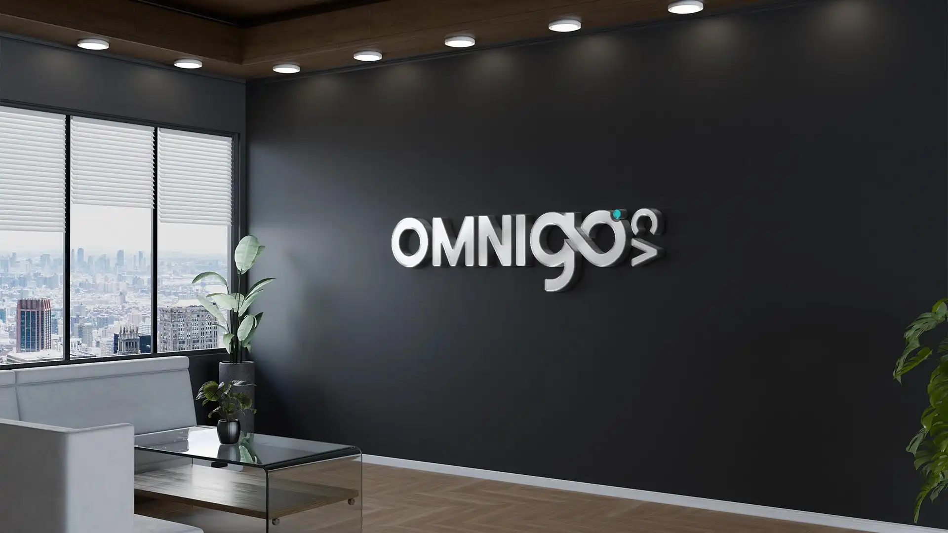
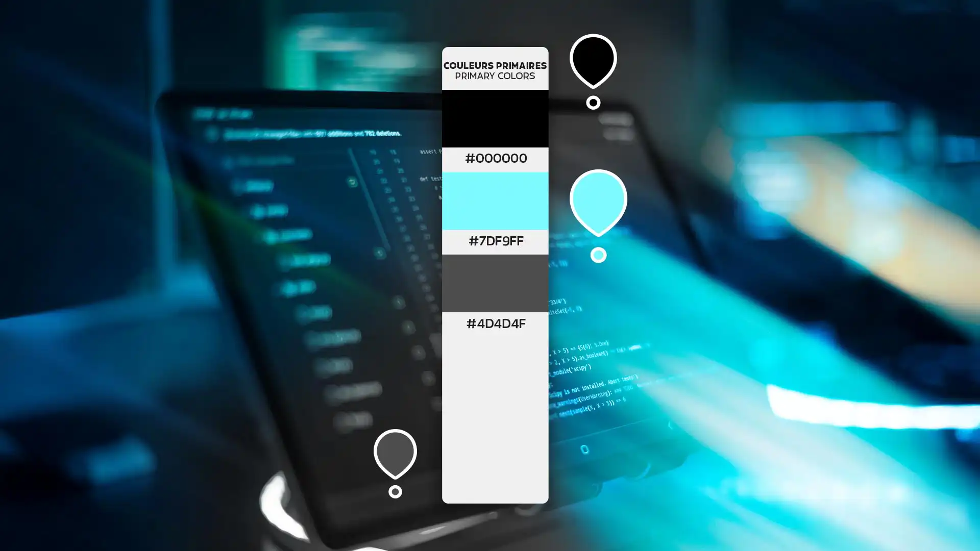
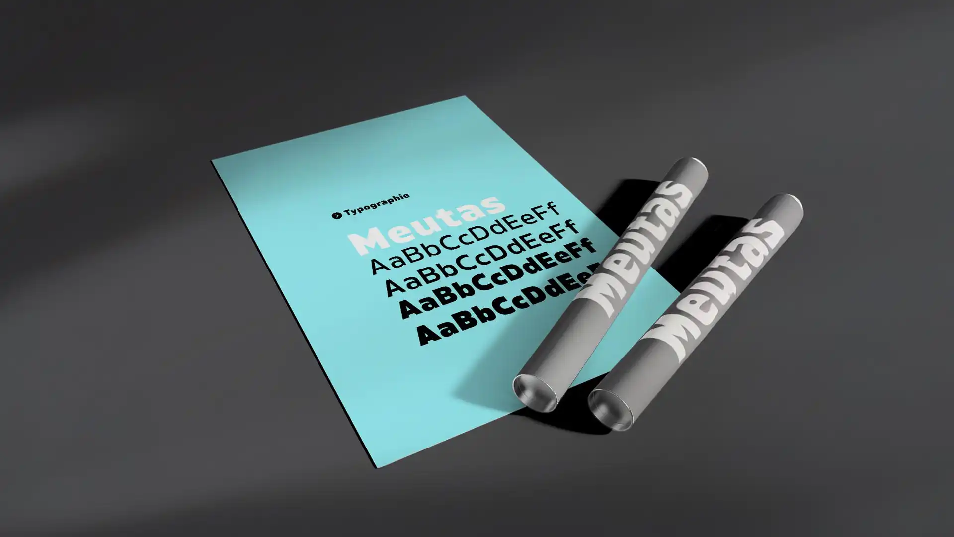
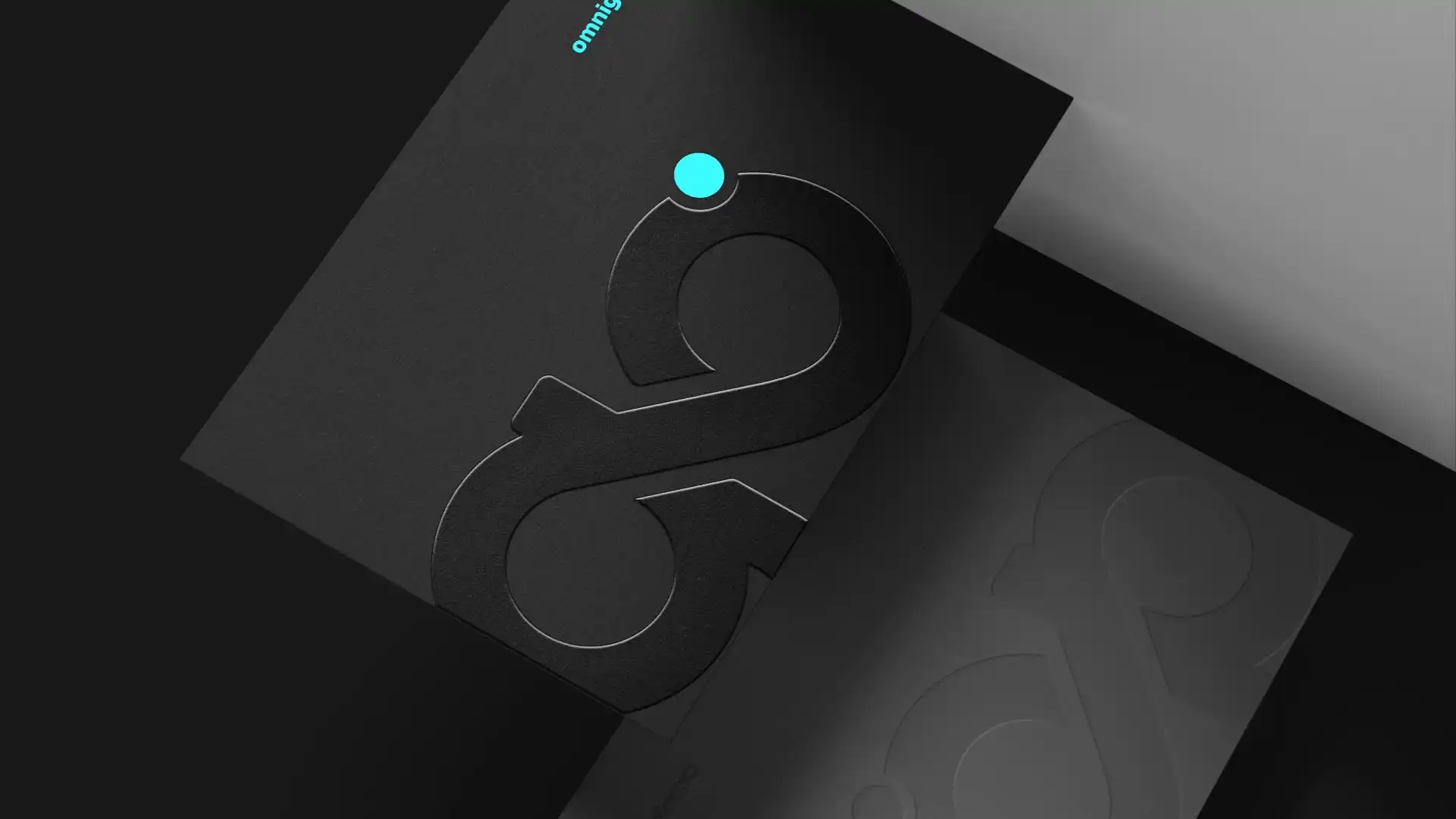
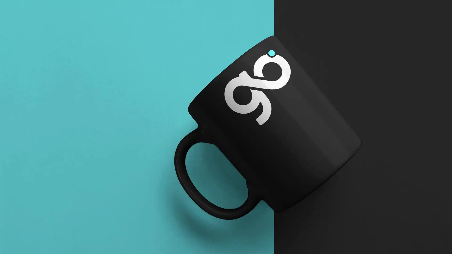
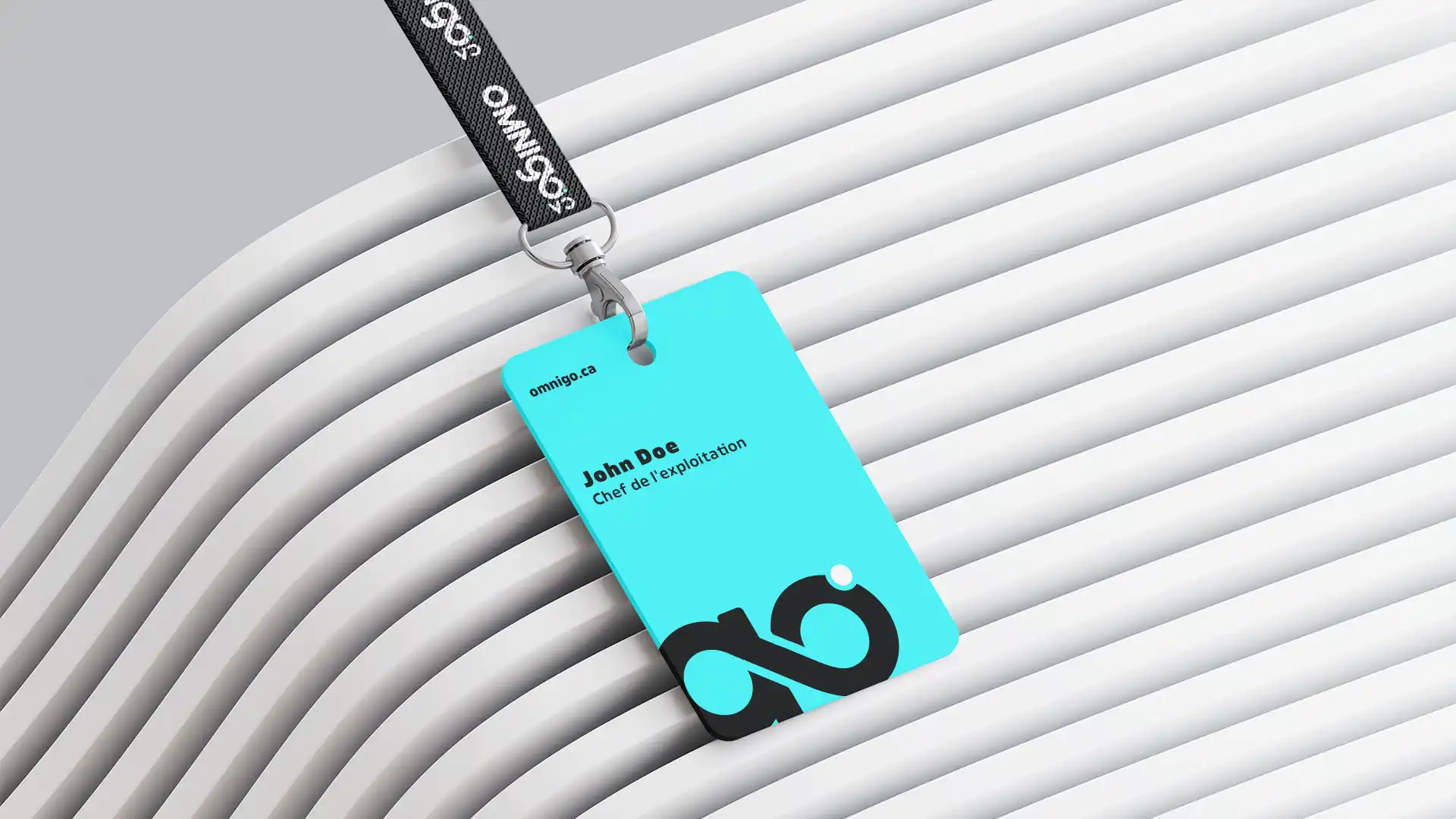
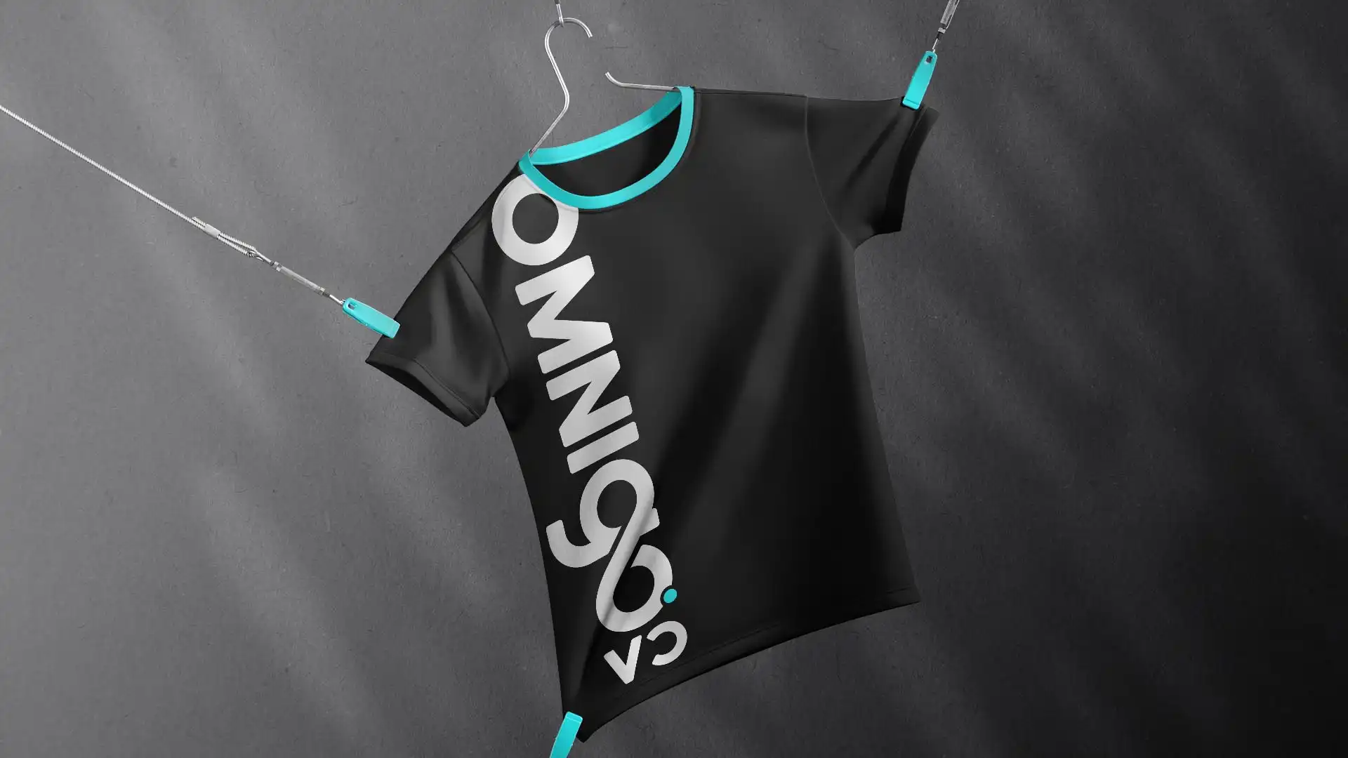
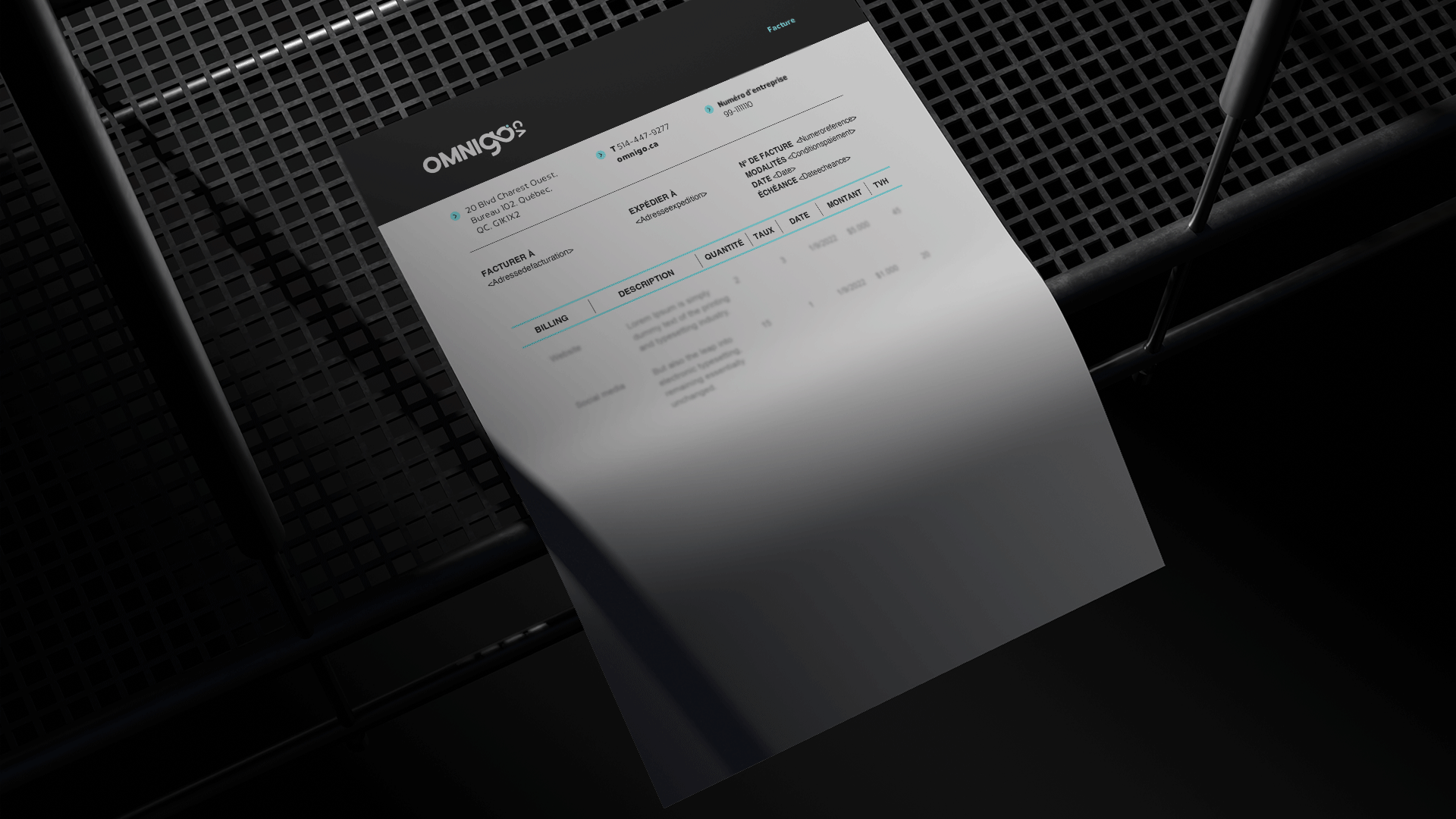
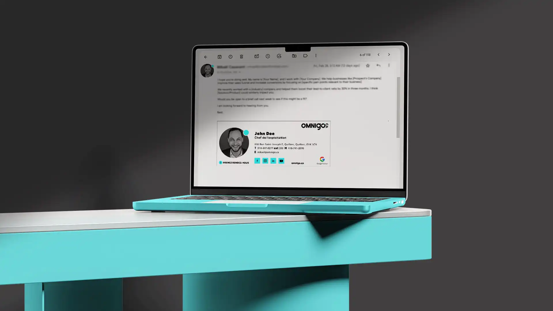
The final identity chosen is based on a simple and dynamic typographic logo. The choice of typography, both contemporary and legible, reflects the accessibility and clarity of the services offered by Omnigo. The color palette consists mainly of electric blue and black, evoking innovation, technological grounding, and professional rigor.
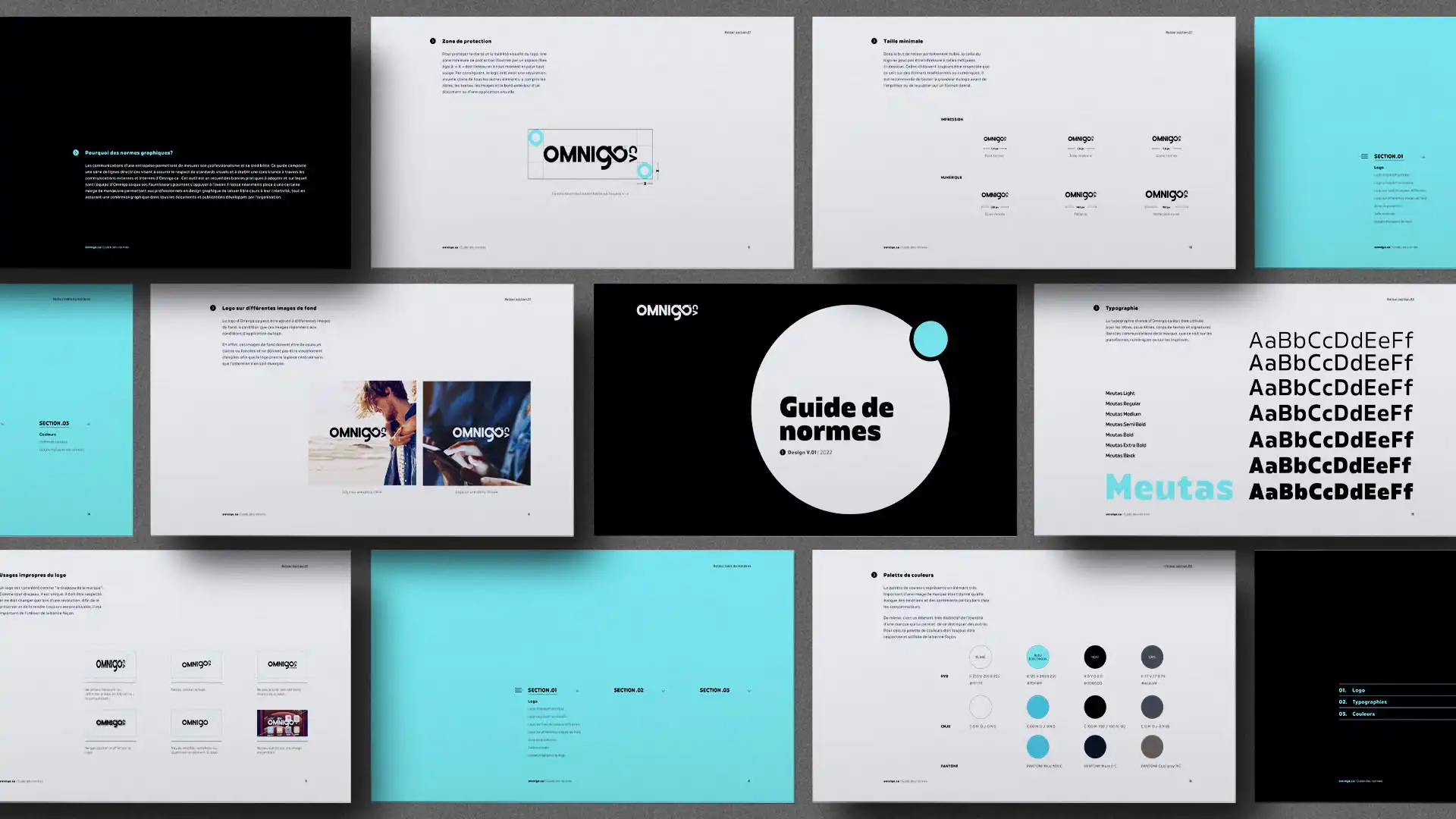
A Flexible and Rigorous Visual System
The visual system designed around the logo allows for multiple variations: monochromes, overlays on photos, uses on light or dark backgrounds. Each use is guided by a detailed style guide that ensures consistency across all company communications. This entire system allows Omnigo to evolve its brand towards a strong, recognizable, and decidedly current identity.
An Identity Rooted in Strategy
This collaborative and iterative approach demonstrates the importance of linking aesthetics to strategic objectives. Omnigo’s visual identity becomes a true vehicle for its promise: to make digital simple, human, and reliable.
"We have worked with Squalls on several major projects. Their attention to detail and leadership make them an indispensable ally in managing our various marketing projects."