To refresh its brand identity, the Non-Profit Organization Ressource Espace Familles was looking for an approach that was structured, intuitive, and true to its personality. Without formal strategic planning, we implemented a methodology based on listening and co-creation. By developing exploratory graphic kits, we enabled the organization to refine its preferences and, through discussions, to reveal a precise visual direction. This participatory and creative approach gave birth to a coherent, colorful, and deeply aligned identity with the organization's human and inclusive mission.
An approach based on listening and experimentation
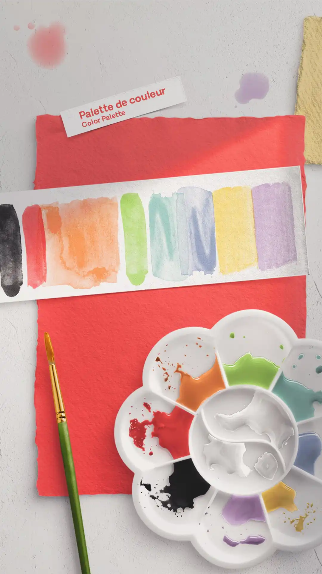
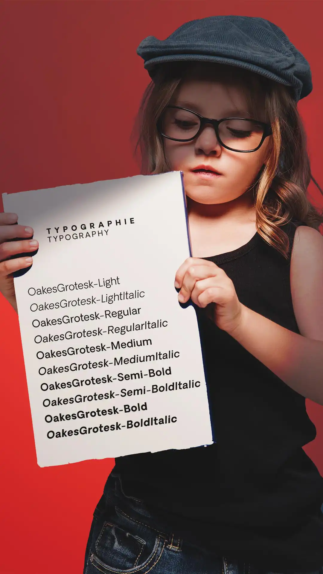
The project begins with a series of meetings aimed at identifying the team’s expectations, understanding the target audiences, exploring the organization’s mission, vision, and values, and identifying the visual references with which the organization identifies. This exploratory phase is materialized by the creation of custom graphic kits, composed of palettes, typographies, iconographic styles, and contrasting visual styles.
Each kit serves as a dialogue tool and decision-making aid. Through the spontaneous reactions and preferences expressed by the Ressource Espace Familles team, we progressively refine the graphic direction to adopt. This accessible and engaging process fosters a natural appropriation of the future visual identity by the NPO’s team.
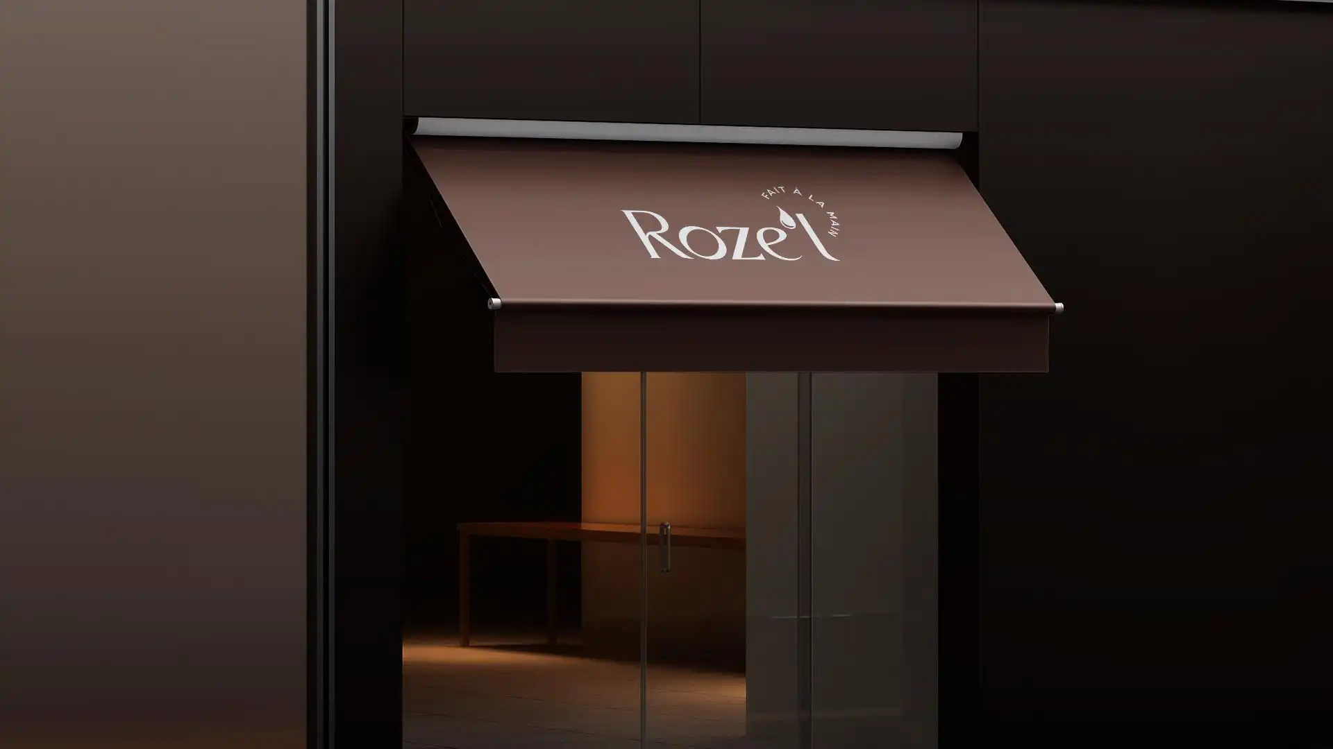
Logo Animation
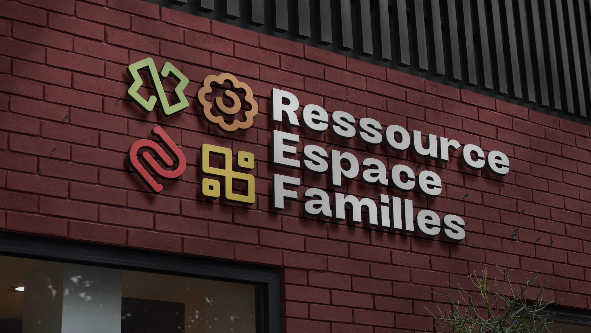
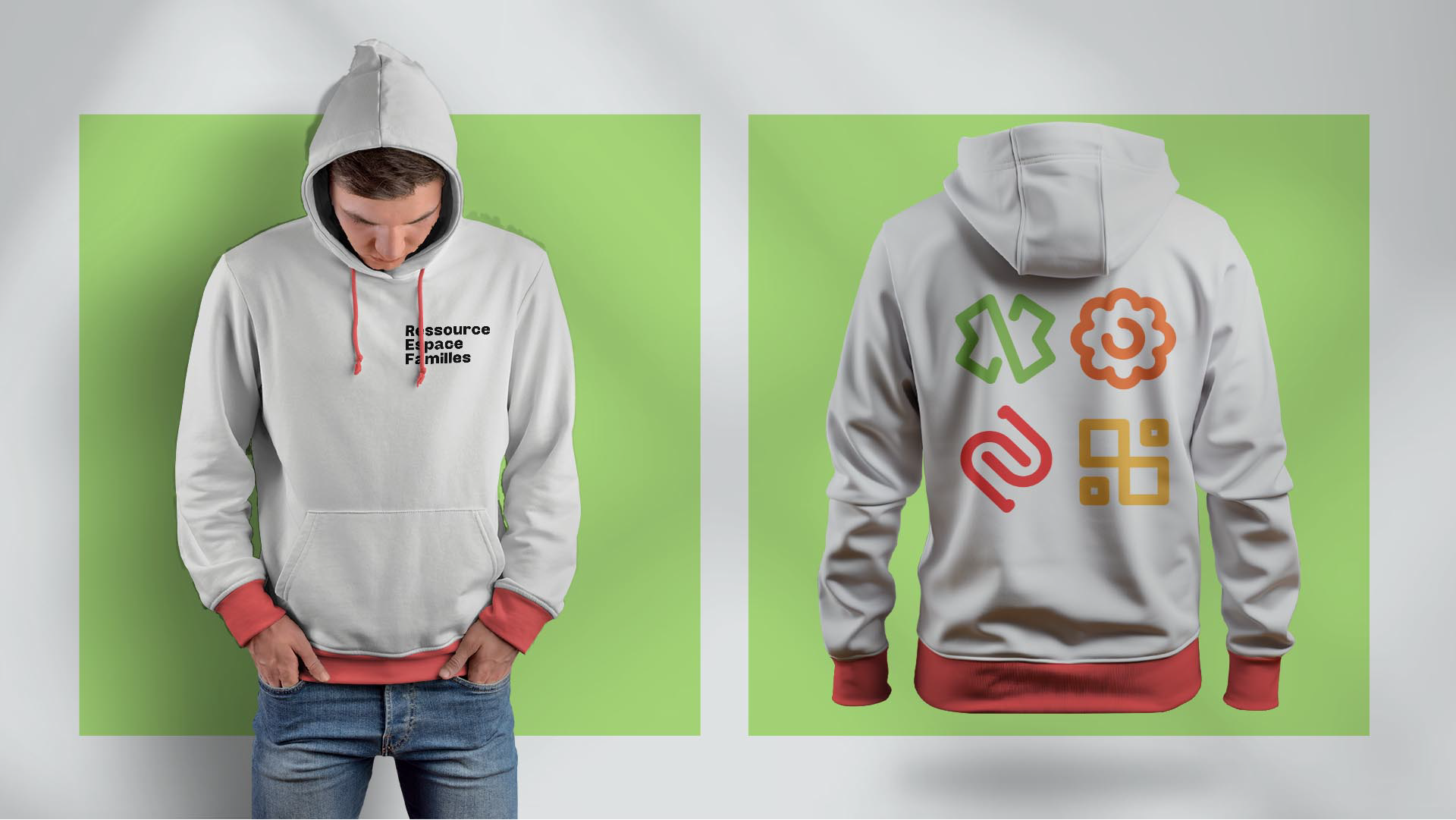
An identity reflecting the organization: welcoming, joyful, and dynamic
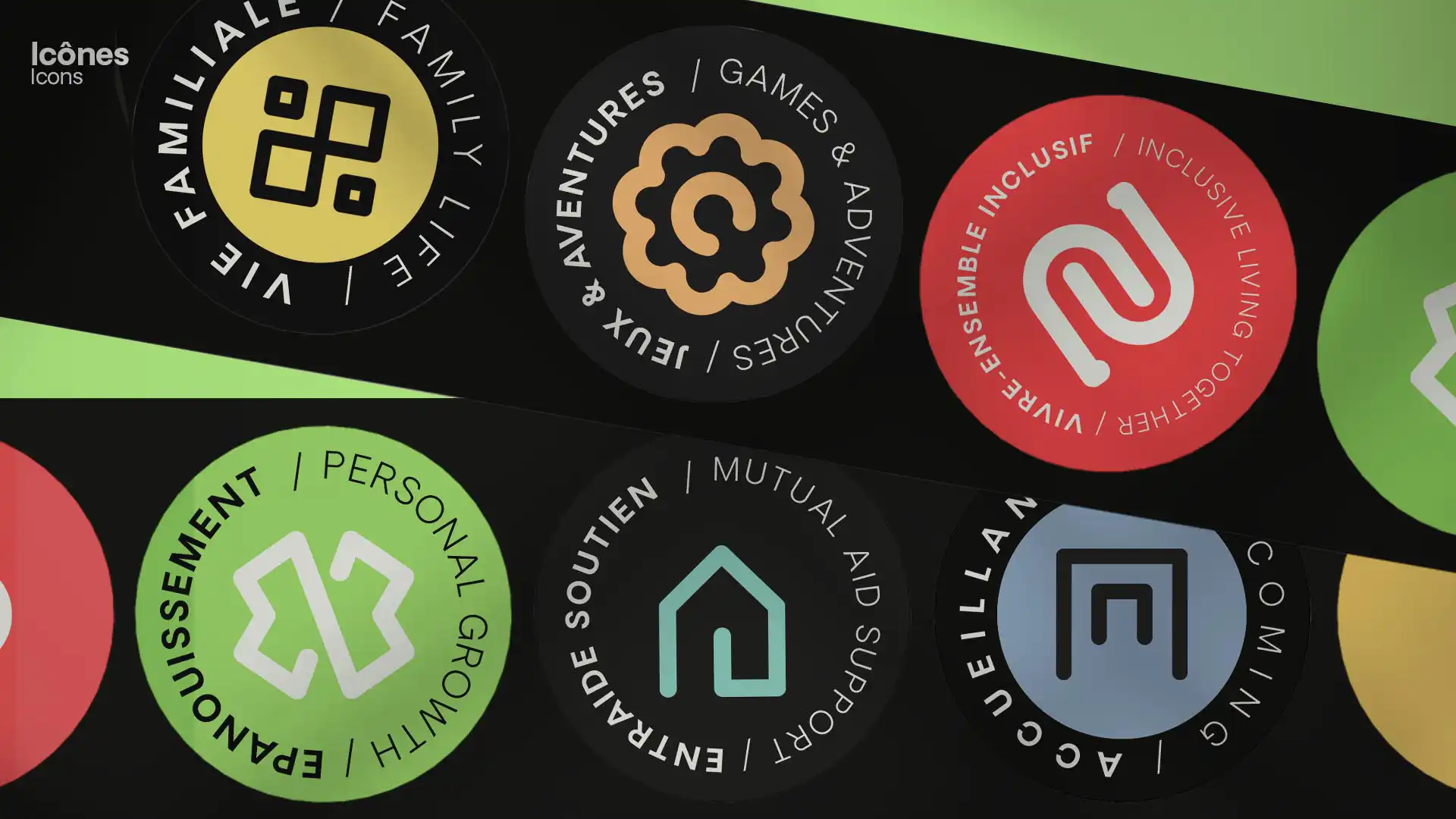
The developed graphic style expresses the organization’s mission of support, benevolence, and diversity. The colors are vibrant without being garish, the typographies are both structured and playful, and the icons add an accessible touch to the overall design. The visual system reflects the team’s openness, warmth, and inclusive approach while affirming the organization’s professional rigor.
A Style Guide to Ensure Consistency and Autonomy
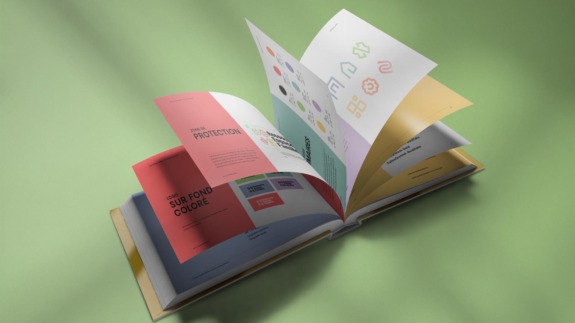
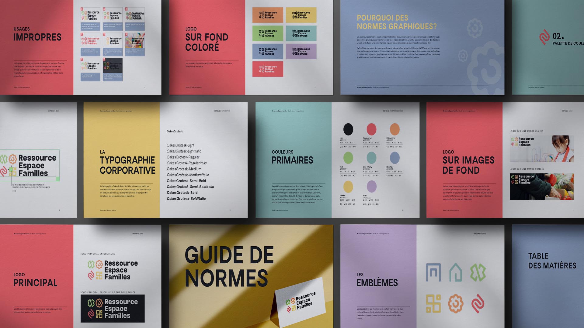
The project concludes with the creation of a comprehensive brand style guide. This document presents all the constituent elements of the brand identity and outlines their uses: logos, colors, typographies, icons, templates, and application rules. Easy to use, it allows the team to maintain the consistency of its communications while adapting visuals to the multiple daily needs.