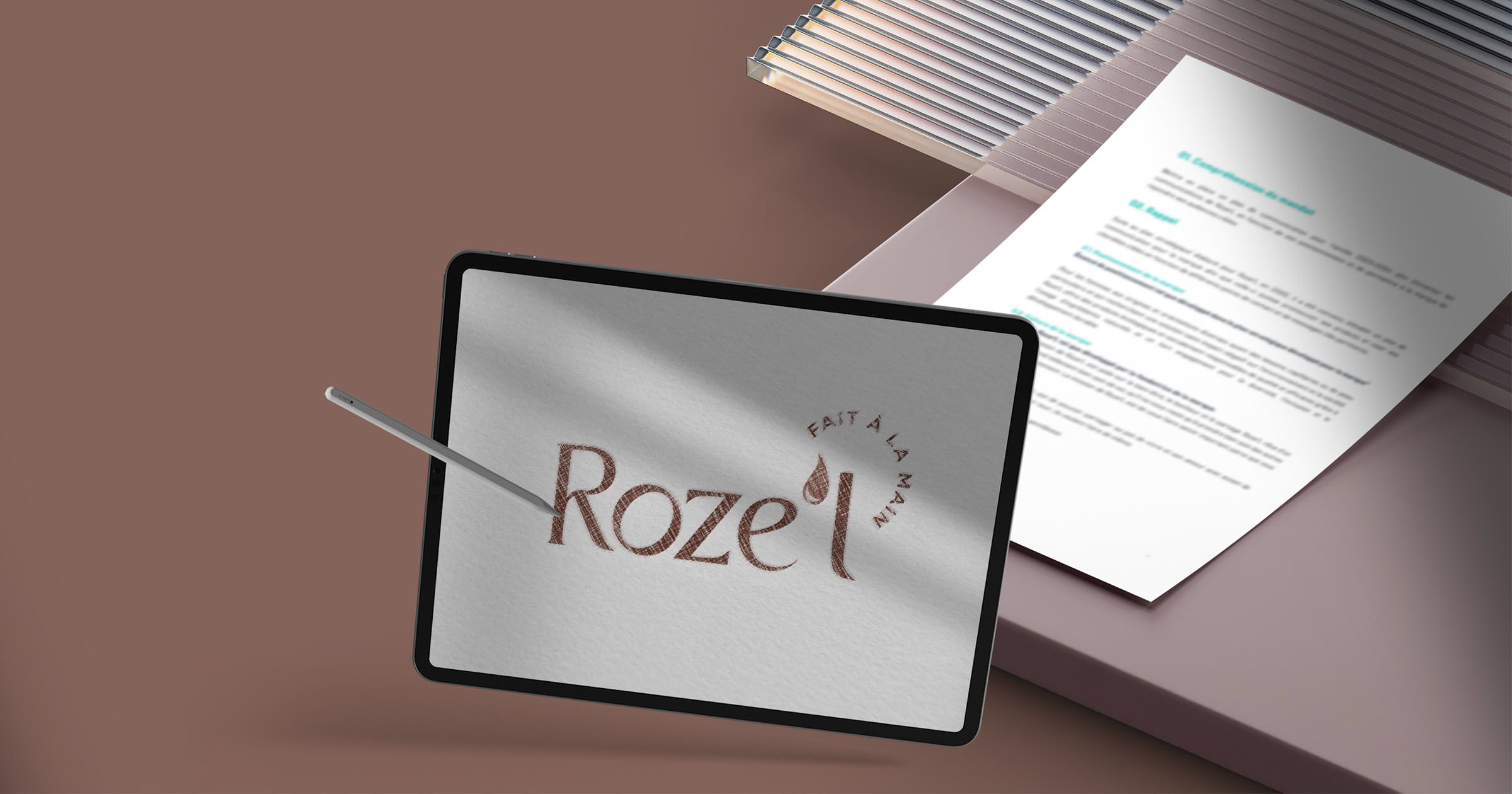
After reviewing its strategic direction, Roze'L sought to evolve its brand image to reflect its renewed positioning, better convey its personality, and solidify its presence in a competitive market. We supported the organization in a comprehensive process of redesigning its visual and narrative identity, in line with the results of its strategic planning. This process enabled the structuring of a strong brand identity, meaningful and rooted in the company's mission and values.
Evolving the Brand Image to Support Transformation
Roze’L is a growing company operating in a highly competitive environment. Following a structuring strategic planning process, it became essential to update the brand image to reflect the organization’s new direction, accurately embody its mission, and support its development.
The objective of our intervention is to translate the insights from strategic planning into a coherent brand identity. This involves evolving the brand’s codes, both visually and narratively, to strengthen its credibility, recognition, and impact.
A creative approach guided by a structured vision
Translating Brand Foundations into a Visual Universe
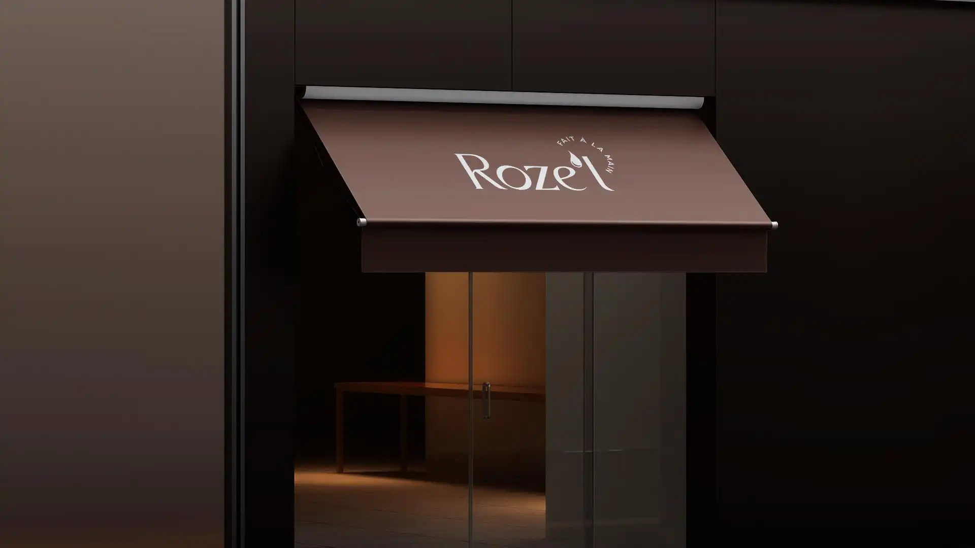
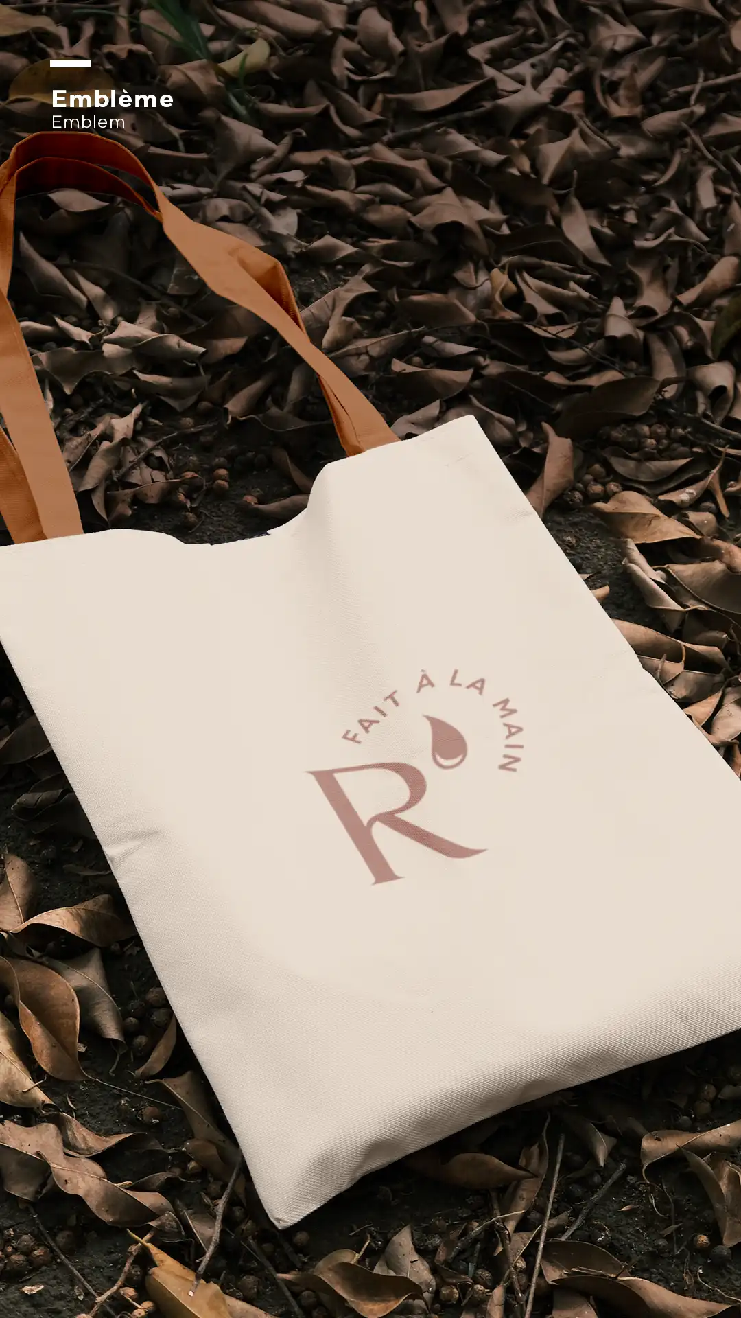
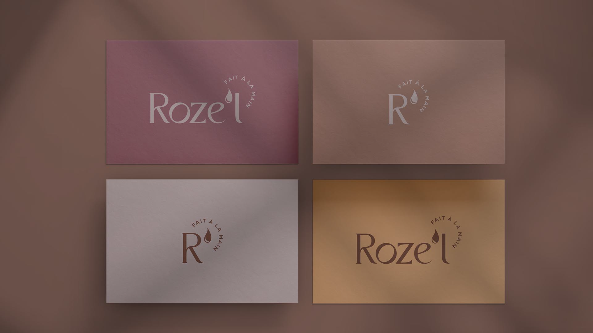
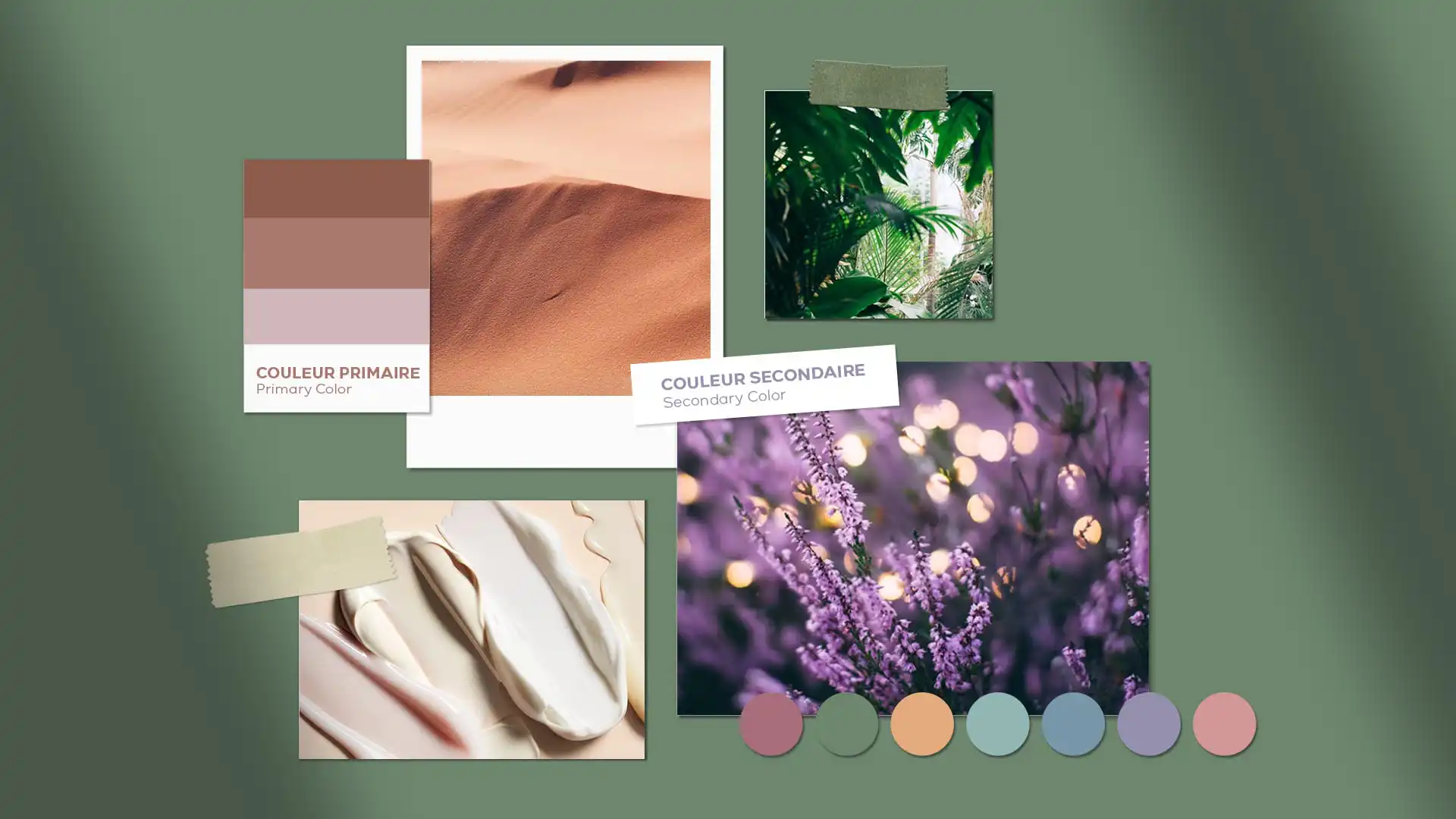
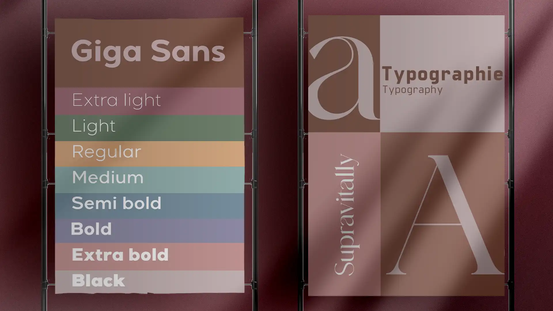
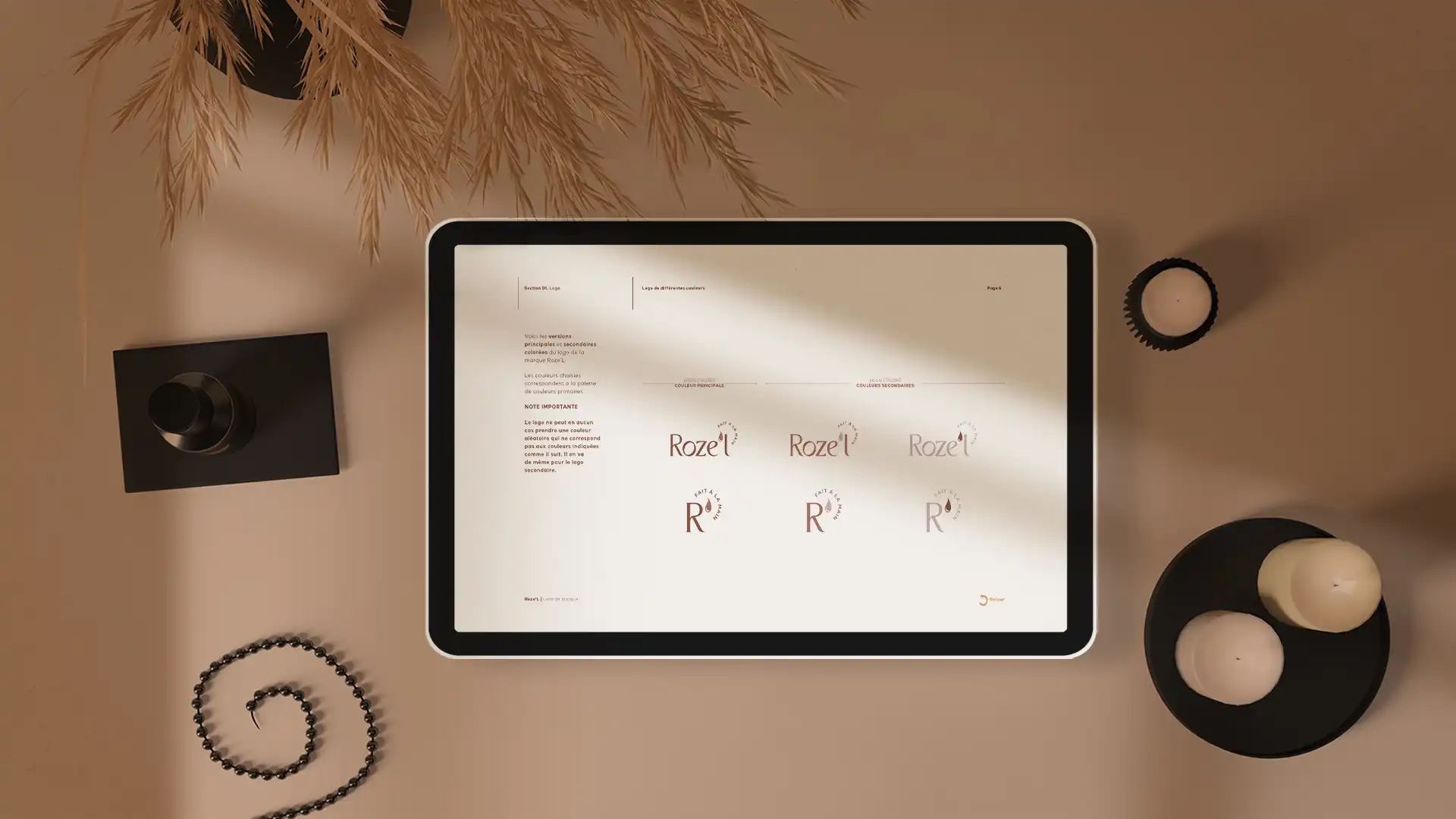
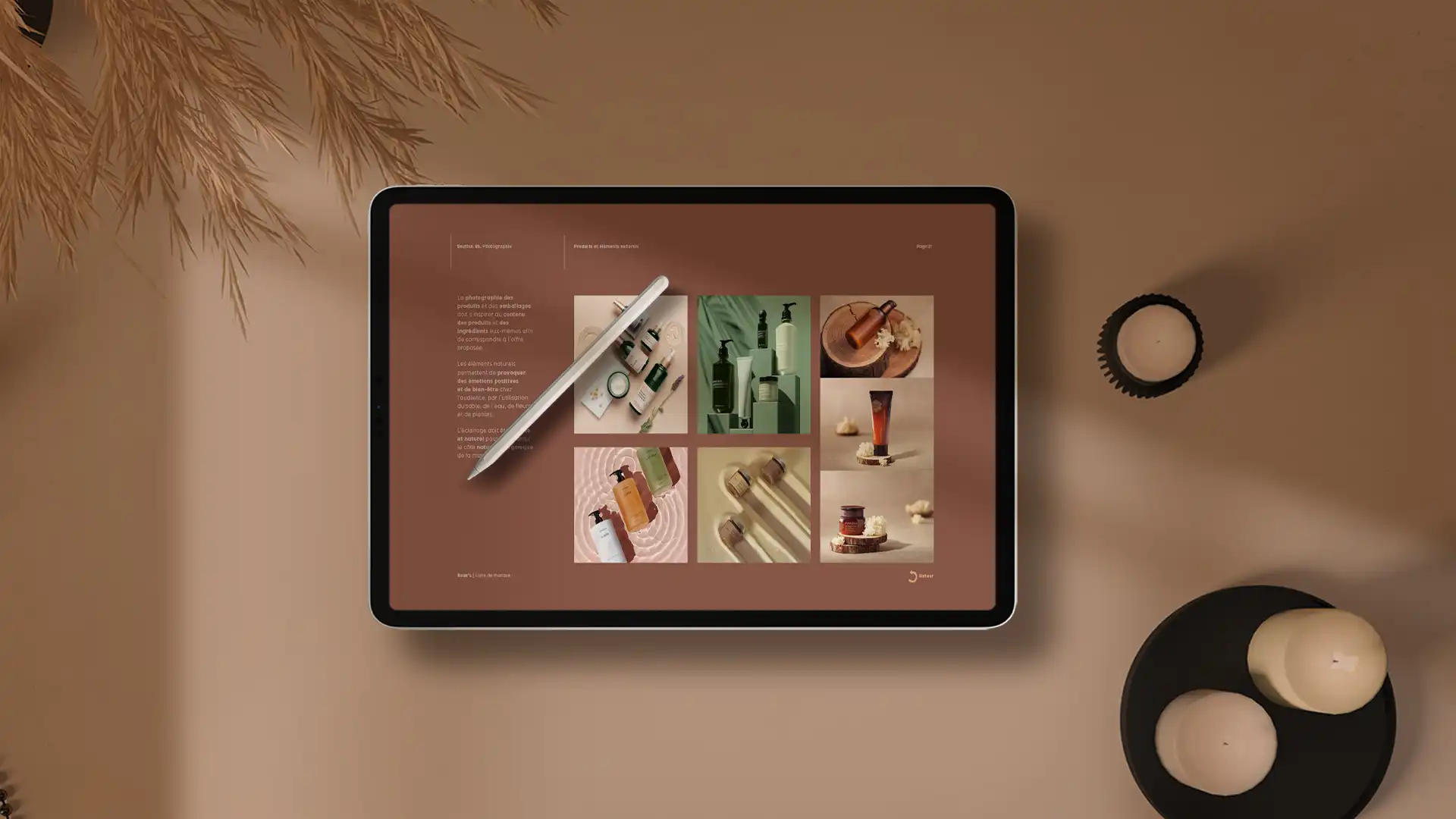
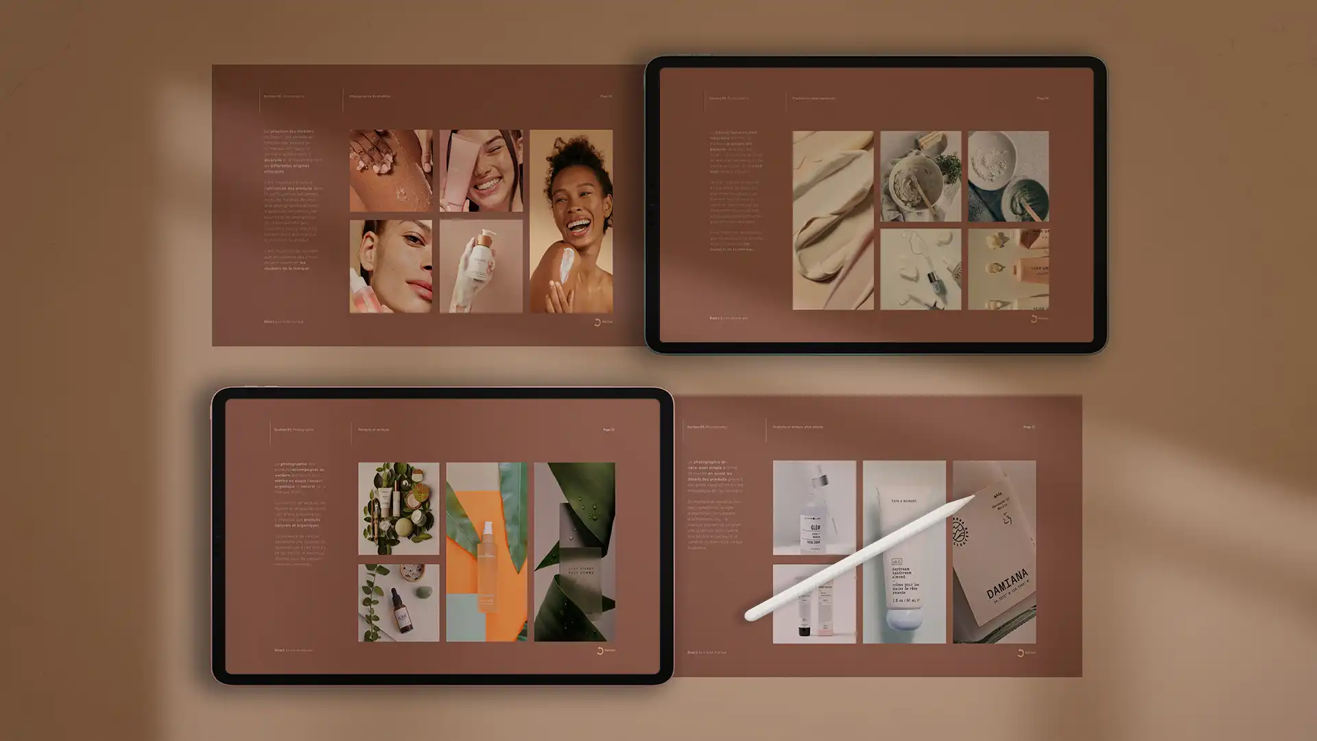
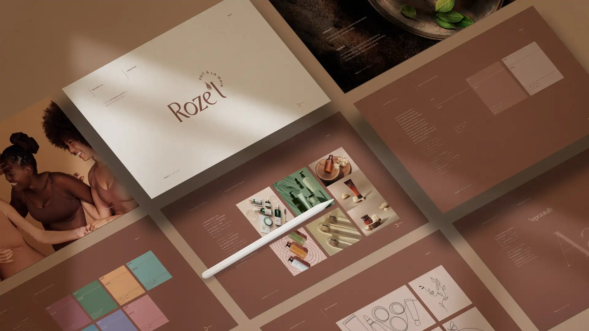
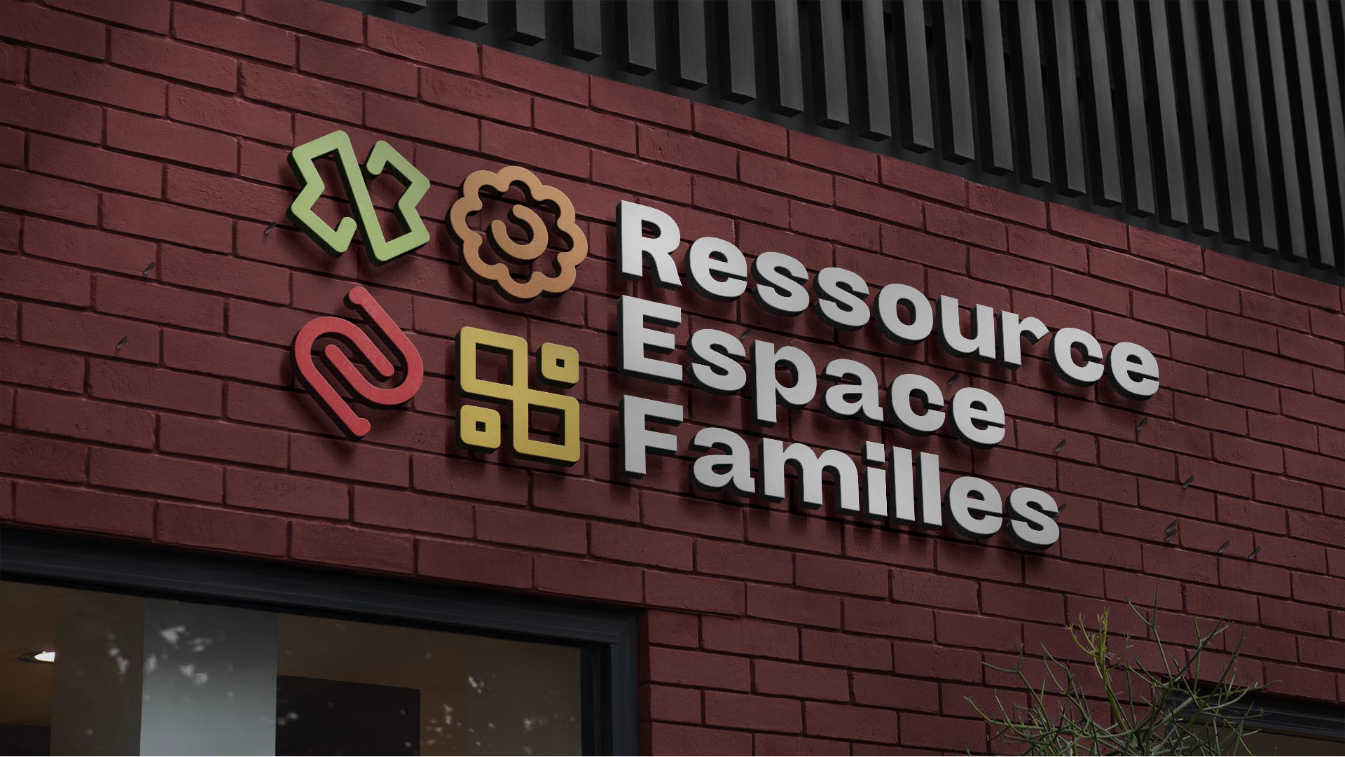
The redesign work is based on an in-depth analysis of Roze’L’s mission, vision, and values. From these elements, we defined the brand’s fundamental attributes and developed a visual universe aligned with its ambitions. This process enabled the conception of a distinctive, professional, and authentic graphic identity, reflecting the company Roze’L has become.
The overall aesthetic, color palette, typography, visual variations, and graphic codes were designed to project the organization into a new phase of its development while respecting the roots of its identity.
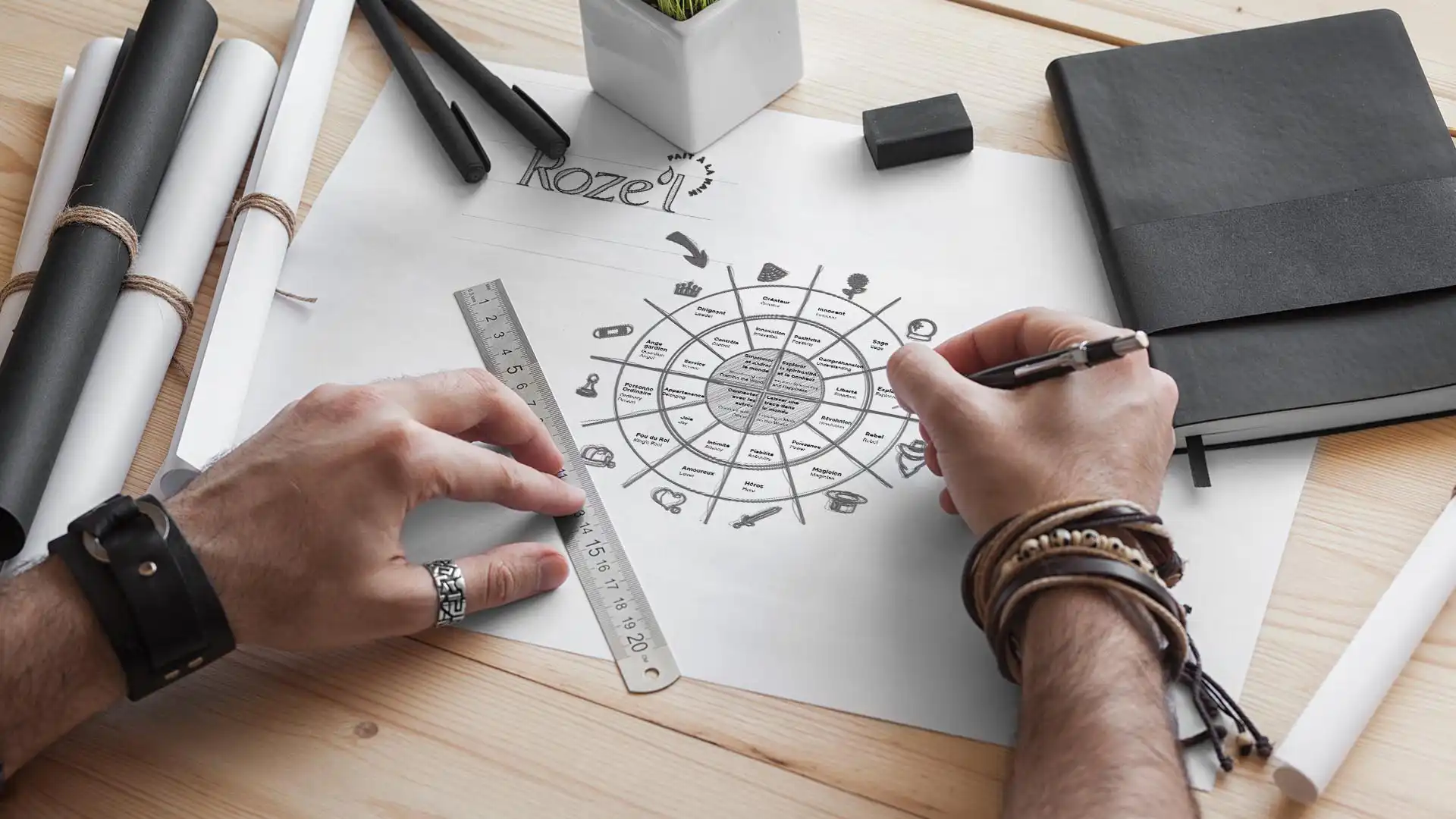
Leveraging Archetypes to Strengthen Brand Personality
As part of the redesign, we analyzed brand archetypes to add depth and coherence to Roze’L’s personality. This work allowed for the emergence of a brand posture that is inspiring, benevolent, and committed. By drawing on universal benchmarks, the dominant archetype serves as a guiding thread for narration, artistic direction, and message tone. It ensures consistency across all touchpoints with target audiences.
When nature and responsibility shape a brand
Highlighting Social Commitment and Connection to Nature
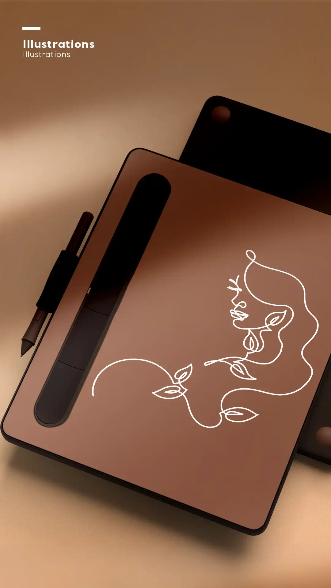
Roze’L is a company deeply rooted in values of social responsibility, environmental respect, and connection to living things. It was essential for the new identity to authentically express this foundation. The brand’s design, visual language, and messages are inspired by nature, materials, and the human gestures that shape the product. This consistency between what the company does, what it is, and what it presents strengthens its credibility and attractiveness.
Structuring the Brand Narrative
In parallel with the visual work, we structured the brand narrative to support more coherent and engaging communication. The tone, vocabulary, storytelling, and key messages were defined to reflect Roze’L’s unique personality and enhance the clarity of its internal and external communications.
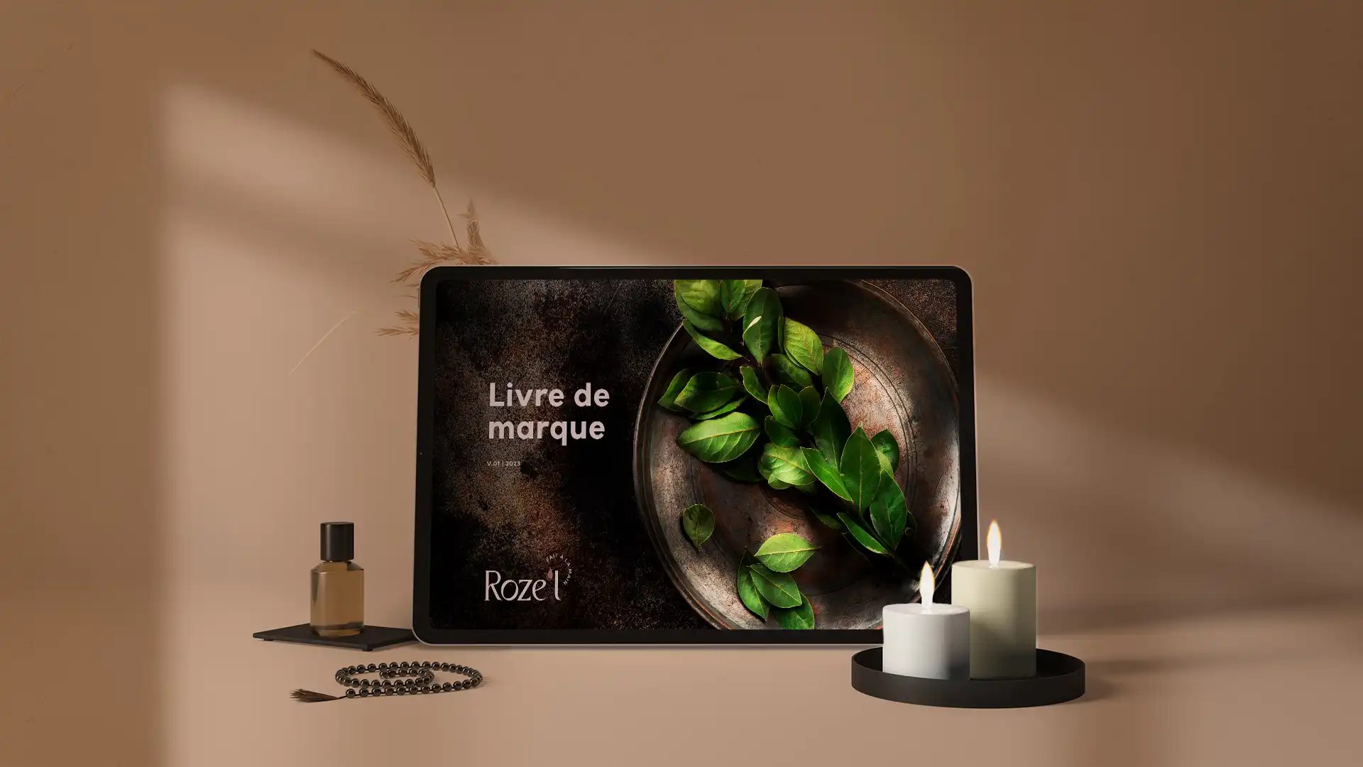
A brand book to ensure consistency and autonomy
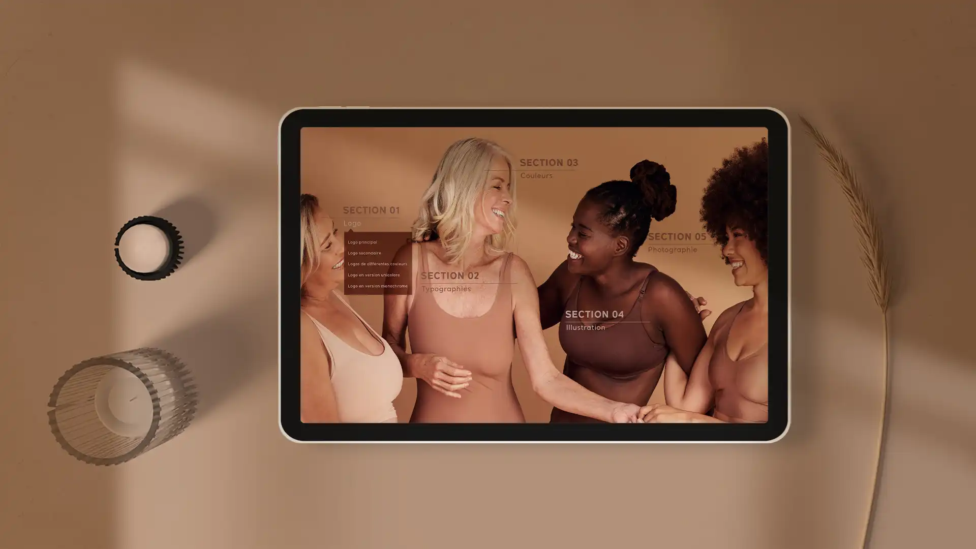
To ensure the longevity of the developed identity, we produced a comprehensive brand book compiling all visual and editorial guidelines. This document serves as a reference for all stakeholders communicating on behalf of Roze’L.
The brand book facilitates the team’s and partners’ adoption of the new identity while ensuring uniform implementation across all channels. It supports the organization’s autonomy in deploying its future communications.
A project that strengthens Roze'L's credibility and coherence
Roze’L’s brand image redesign solidifies the foundations laid during strategic planning. It enables the company to project an image aligned with its ambitions, better communicate its value proposition, and position itself as a distinct player in its sector. This project illustrates how a rigorous creative approach can become a powerful strategic lever for growth.
The Squalls team knows how to identify not only the needs of its clients and potential clients but also the person behind the company, which allows for a smooth and pleasant relationship. It is an absolute delight to work with the team. Their skills are superb, and their approach is magnificent. I highly recommend any company to do business with Squalls!